 EN
EN
 FR
FR DE
DE PT
PT ES
ES AR
AR BG
BG HR
HR CS
CS DA
DA FI
FI NL
NL EL
EL IT
IT JA
JA KO
KO NO
NO PL
PL RO
RO RU
RU SV
SV CA
CA TL
TL IW
IW LV
LV LT
LT SR
SR SK
SK SL
SL ET
ET MT
MT TH
TH FA
FA AF
AF MS
MS SW
SW GA
GA KA
KA
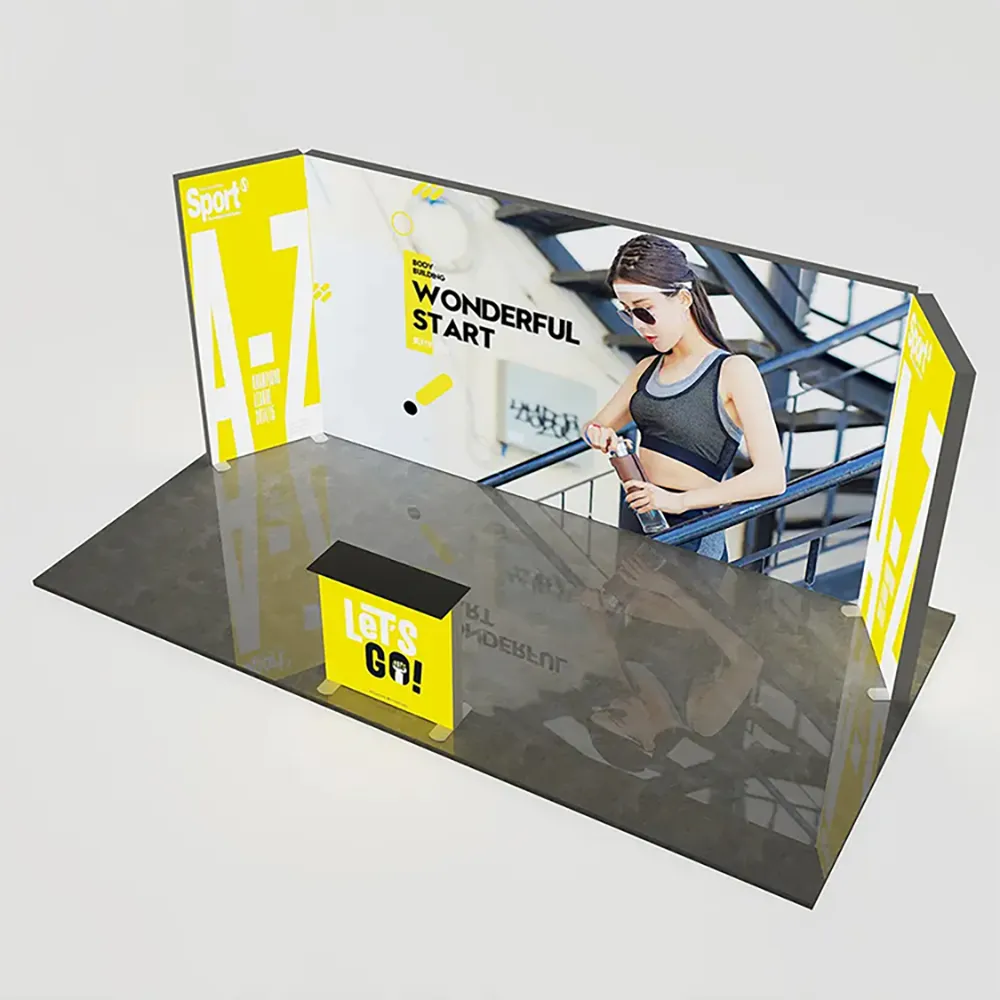
The trade show booth color scheme is one of the most underestimated yet powerful elements of exhibition design. While many exhibitors focus heavily on product features and messaging, the visual impact created by your trade show booth color scheme directly influences how visitors perceive your brand, how long they stay at your booth, and whether they engage with your team. Colors do not simply decorate a space; they trigger psychological responses, guide attention, and communicate brand values before a single word is spoken. Understanding how to leverage your trade show booth color scheme can mean the difference between a booth that attracts casual passersby and one that converts booth visitors into meaningful business leads.
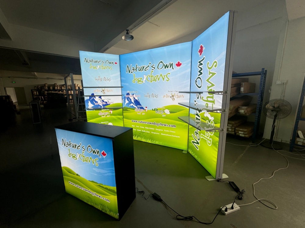
Visitor perception at a trade show booth is shaped within the first few seconds of approach. The trade show booth color scheme you select sets the tone for that entire interaction, creating an emotional and psychological foundation before your sales team even makes eye contact. Color science has long established that different hues evoke distinct responses: warm colors like red and orange energize and excite, cool colors like blue and green calm and reassure, while neutral tones like white and gray convey professionalism and sophistication. When your trade show booth color scheme aligns with your brand identity and your target audience's expectations, it creates immediate credibility and relevance. Conversely, a misaligned or poor trade show booth color scheme can repel visitors or signal that your company lacks attention to detail.
How Trade Show Booth Color Scheme Influences First Impressions
The Psychology Behind Color Selection
Every trade show booth color scheme sends a psychological message that begins processing the moment a visitor's eyes land on your booth. Red in a trade show booth color scheme creates urgency and draws attention, making it ideal for companies wanting to stand out in crowded exhibition halls. Blue conveys trust and stability, making it a preferred choice in finance, technology, and professional services sectors. A well-designed trade show booth color scheme using blue helps visitors feel secure and confident in your brand. Yellow and orange energize spaces and communicate creativity and approachability, often used effectively by consumer brands and startups. The trade show booth color scheme you choose essentially pre-qualifies your audience by attracting people who resonate with the emotions that color combination triggers.
Contrast and Visibility in Crowded Spaces
In a busy trade show environment, your trade show booth color scheme must achieve visibility among hundreds of competing booths. High-contrast trade show booth color schemes work best because they create visual distinction and make your booth stand out on the exhibition floor. A dark trade show booth color scheme with bright accent colors, or a light trade show booth color scheme with saturated primary colors, forces the eye to focus. However, the trade show booth color scheme must still remain legible; excessive contrast or too many colors muddy the message and confuse visitors. Strategic use of your trade show booth color scheme—perhaps using two primary colors plus one accent—provides visual impact without overwhelming or confusing passing visitors who have only seconds to decide whether your booth is worth entering.
Trade Show Booth Color Scheme and Visitor Dwell Time
Creating Visual Comfort and Engagement
Dwell time—the length of time a visitor stays at your booth—is directly impacted by how comfortable they feel in the visual environment. A trade show booth color scheme that is too bright or uses jarring color combinations fatigues the eye and unconsciously pushes visitors away. Conversely, a thoughtful trade show booth color scheme that balances visual interest with visual rest encourages visitors to linger. Warm, inviting color palettes in your trade show booth color scheme make visitors feel welcome and create psychological safety. If your trade show booth color scheme includes natural or organic tones combined with accent colors, visitors are more likely to spend time exploring your products, reading your materials, and engaging in meaningful conversations with your team. This extended dwell time directly correlates to higher quality interactions and better lead generation outcomes.
Color Consistency and Brand Recognition
When your trade show booth color scheme aligns with your established brand identity, visitors experience consistency that strengthens recognition and recall. If your company's core brand colors appear in your trade show booth color scheme, visitors immediately understand who you are and what you represent. This brand continuity in your trade show booth color scheme increases the likelihood that visitors will remember your booth after the show ends. A disjointed trade show booth color scheme that strays too far from brand guidelines creates confusion and dilutes brand recognition. The most effective trade show booth color scheme reinforces existing brand associations while adding depth through strategic use of accent colors and lighting that supports the overall exhibition environment.
Practical Implementation Strategies for Trade Show Booth Color Scheme
Adapting Trade Show Booth Color Scheme to Industry Context
The optimal trade show booth color scheme depends significantly on your industry and target audience expectations. Technology and finance sectors typically prefer professional trade show booth color schemes featuring deep blues, grays, and whites that communicate stability and expertise. Healthcare and wellness sectors often use calming trade show booth color schemes with greens, soft blues, and whites to suggest trust and care. Creative industries and consumer brands leverage bold, vibrant trade show booth color schemes with saturated colors and unexpected combinations to communicate innovation and energy. Your trade show booth color scheme should reflect not only your brand but also the visual language your specific audience expects. Researching competitor booths provides insight into what trade show booth color scheme conventions exist in your space, allowing you to align or strategically differentiate as appropriate.
Lighting and Material Effects on Trade Show Booth Color Scheme
The trade show booth color scheme you select on a computer screen will appear differently under actual exhibition hall lighting conditions. Booth lighting dramatically affects how your trade show booth color scheme is perceived; cool LED lighting can make colors appear cooler and more clinical, while warm lighting softens and warms a trade show booth color scheme. Backlit fabric displays and illuminated elements can intensify or mute colors in your trade show booth color scheme depending on the light source used. High-quality professional lighting specifically designed for your trade show booth color scheme ensures colors display as intended and creates visual depth that attracts visitors. trade show booth color scheme implementation often requires professional display solutions that combine lighting with color accuracy to achieve maximum impact.
FAQ
Can a single color dominate a trade show booth color scheme effectively?
Yes, a single dominant color can work effectively in a trade show booth color scheme if supported by complementary neutrals or accent colors. A monochromatic trade show booth color scheme using varying tints and shades of one color creates sophistication and strong brand identity. However, most successful trade show booth color schemes combine one primary color with a secondary color and accent color to provide visual interest and guide visitor attention to key products or messaging areas. Single-color trade show booth color schemes work best for established brands with very strong brand recognition where the color itself is iconic.
How should trade show booth color scheme change seasonally or by location?
While your core trade show booth color scheme should remain consistent with brand guidelines, seasonal adjustments or location-based variations can enhance relevance. Winter trade show booth color schemes might incorporate cooler or deeper tones, while summer venues might feature lighter or warmer variations of your brand colors. International trade shows may require adjusting your trade show booth color scheme to respect cultural color preferences; for example, white symbolizes purity in Western culture but mourning in some Asian cultures. However, your fundamental trade show booth color scheme should stay recognizable; adapt through accent colors, lighting intensity, or material finish rather than completely changing your core color palette.
What trade show booth color scheme mistakes should exhibitors avoid?
Common mistakes in trade show booth color scheme selection include using too many colors which creates visual chaos, selecting colors purely for personal preference rather than strategic branding, failing to test your trade show booth color scheme under actual lighting conditions, and ignoring your target audience's color psychology expectations. Avoid trade show booth color schemes with poor contrast between text and background, colors that clash with adjacent booths without intention, and bright neon colors unless your brand specifically demands high energy. The worst trade show booth color scheme error is treating color as purely decorative rather than as a strategic communication tool that directly influences visitor behavior, perception, and dwell time.